Billers Agent Portal
The Problem - Outdated, Fragmented Software & UX
ACI Worldwide was facing a critical challenge: their software was outdated, fragmented from legacy systems, and primarily designed by developers, resulting in poor user experiences. Some of their applications were over 15 years old, causing clients to lose confidence. Several major clients, including MetLife, threatened not to renew multi-million dollar contracts unless ACI modernized and revamped their UX. That’s when I was brought in, tasked with transforming the user experience across multiple departments, starting with the Billers team, which urgently needed a new solution to keep their largest clients.
The Solution
Unifying Billers’ Payment Solutions
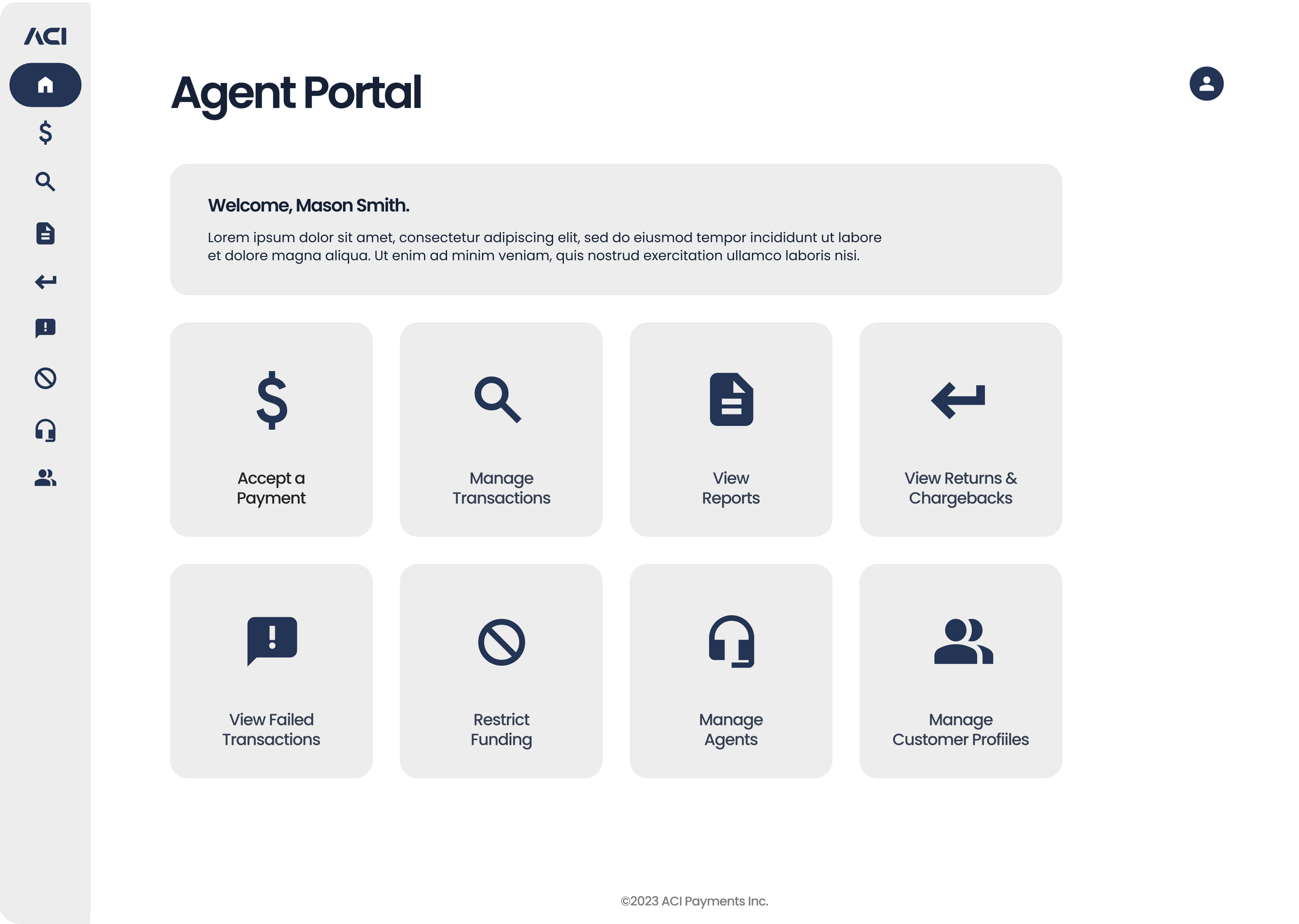
To address the fragmented system, I developed a single portal that unified all biller applications under one platform with a seamless SSO login. Instead of juggling multiple browser windows, users could now manage everything in one place—from adding and managing customer profiles to setting up recurring billing and payment methods, and even accepting payments over the phone. The clean, minimal UI instilled confidence in clients like MetLife, helping to secure their contract renewal.
Adding a Customer
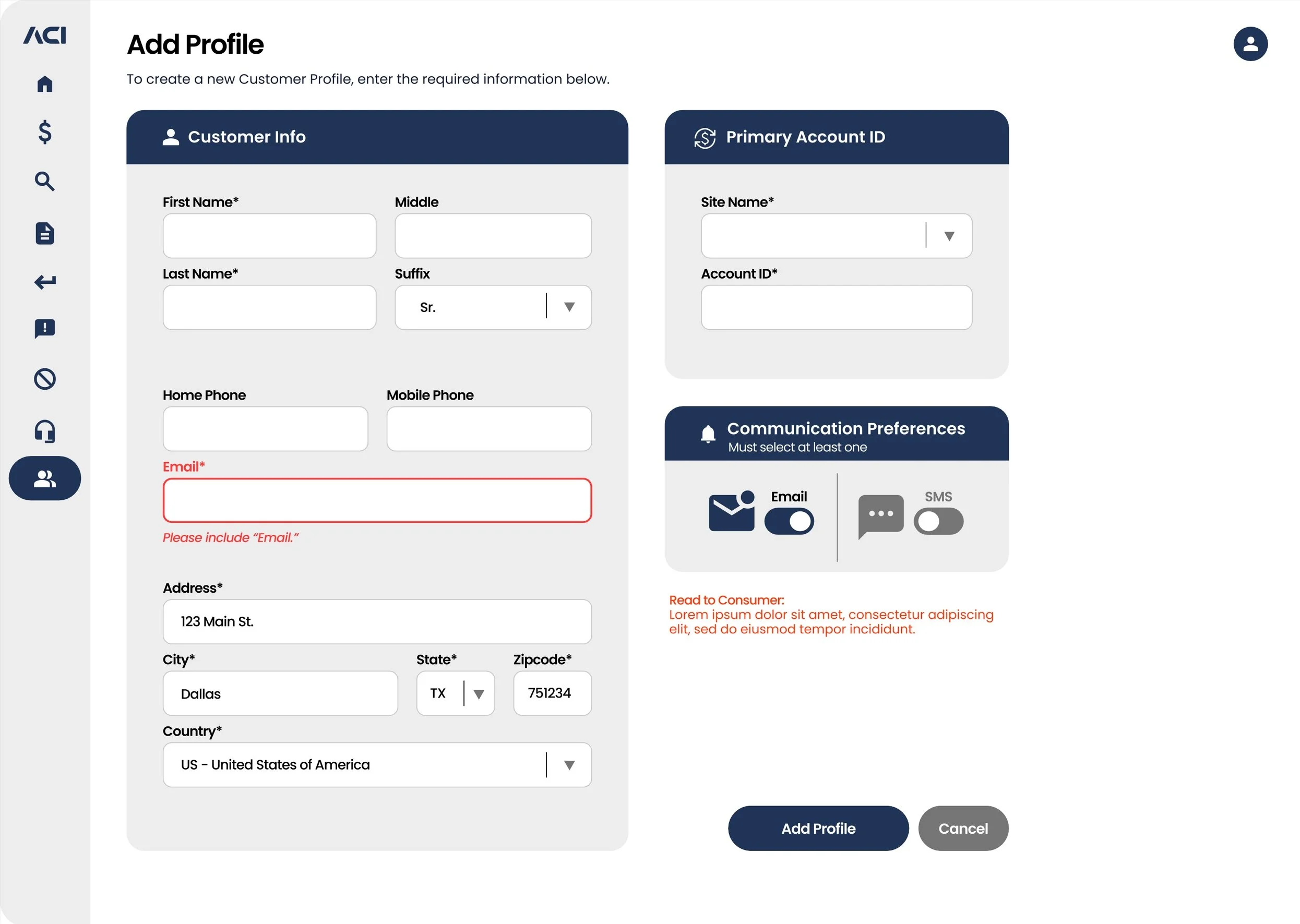
The “Add Customer” screen is designed to streamline user input with a clean, efficient layout. Here, users can quickly enter key customer information, such as name, phone number, email, address, and primary account ID. Additionally, the portal allows users to easily set communication preferences, choosing between text or email for notifications. This simplified data entry process ties seamlessly into the larger Billers portal, where all customer profiles and billing activities are centralized.
Adding a Payment Method
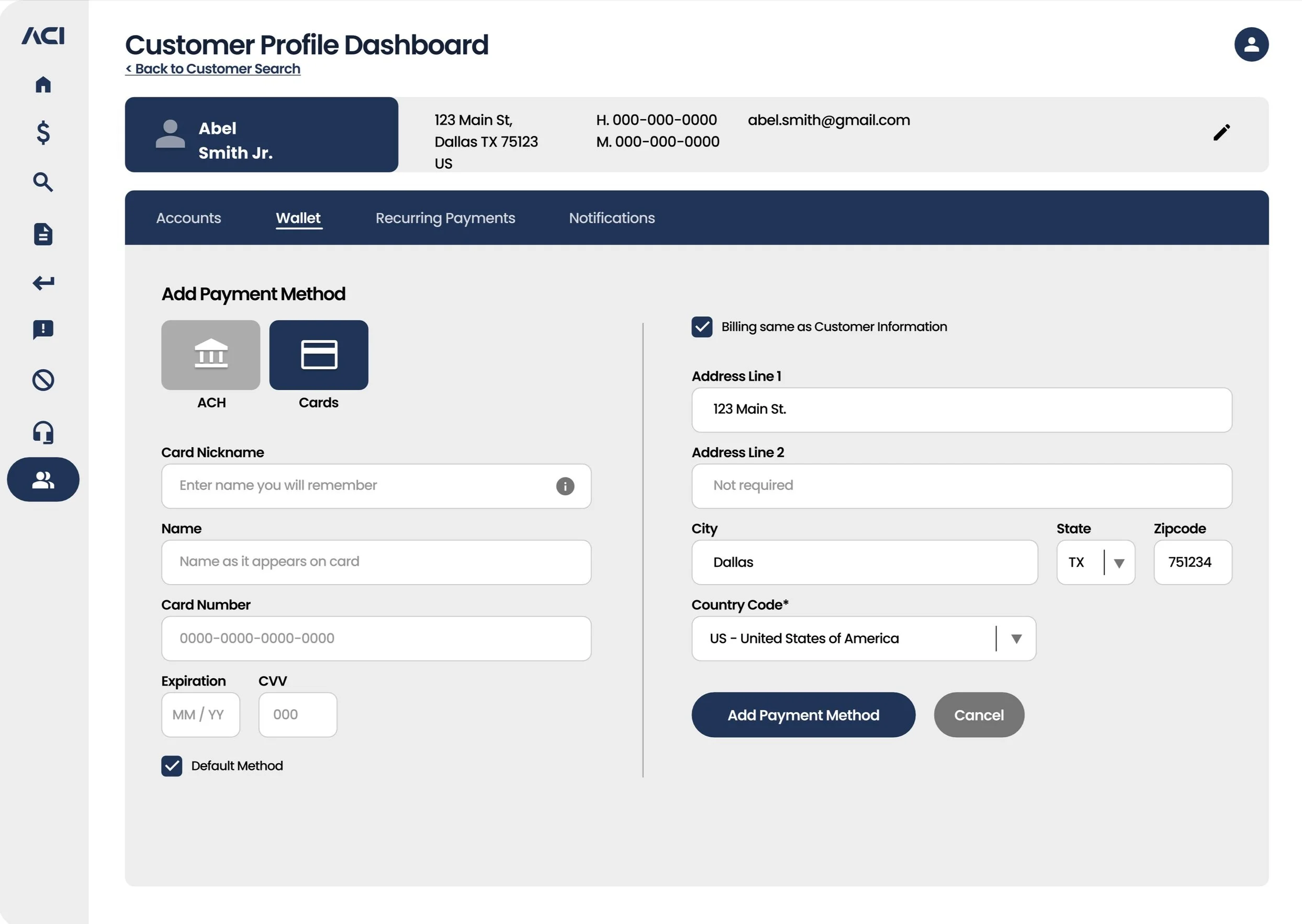
The “Add Payment Method” screen allows CSR’s (users) to easily input and manage payment options, whether adding a credit card or a bank account. The screen includes fields for all relevant details such as the billing address associated with the card or account. A key feature is the checkbox that lets users set the selected payment method as the default for any recurring billing the customer may have.
Managing Recurring Payments
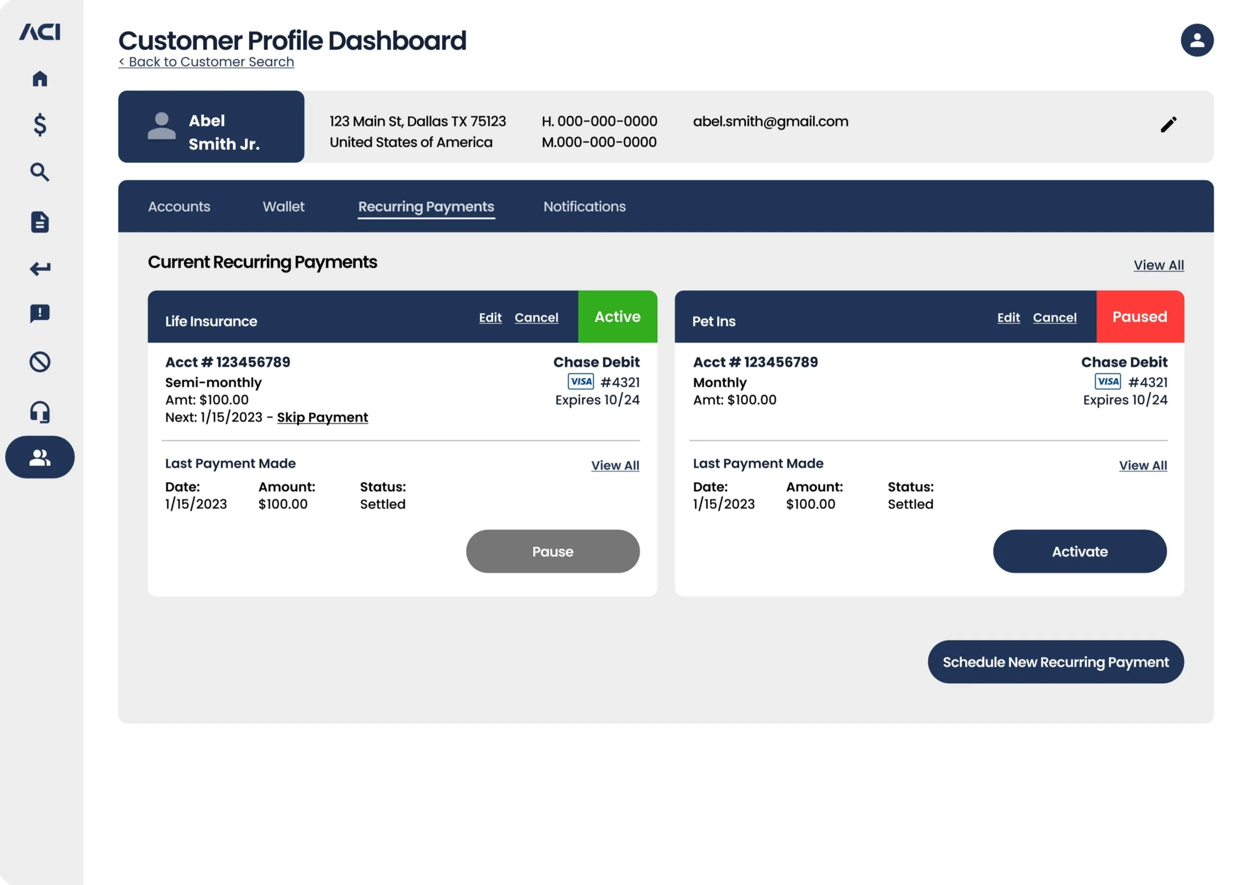
The “Managing Recurring Payments” screen provides users with an organized overview of all existing scheduled payments. Each recurring payment is displayed as a high-level card, with the cards stacked based on the number of scheduled payments. To enhance usability, a color-coded system allows users to quickly distinguish between active and paused payments. The streamlined design ensures users can easily manage existing payments or add new ones with a simple click, making it effortless to stay on top of recurring billing cycles within the Billers portal.
Client Approval:
A Game-Changing Review
MetLife’s make-or-break moment came during a critical Zoom call where 30 of their key employees reviewed our Figma prototypes. The pressure was on, but the results were undeniable—everyone loved the new direction and praised the simplicity and ease of use of the portal. This positive feedback solidified MetLife’s confidence in the solution, leading to their decision to renew their multi-million dollar contracts with ACI Worldwide. The streamlined design and user-friendly experience proved to be exactly what they needed to move forward.


