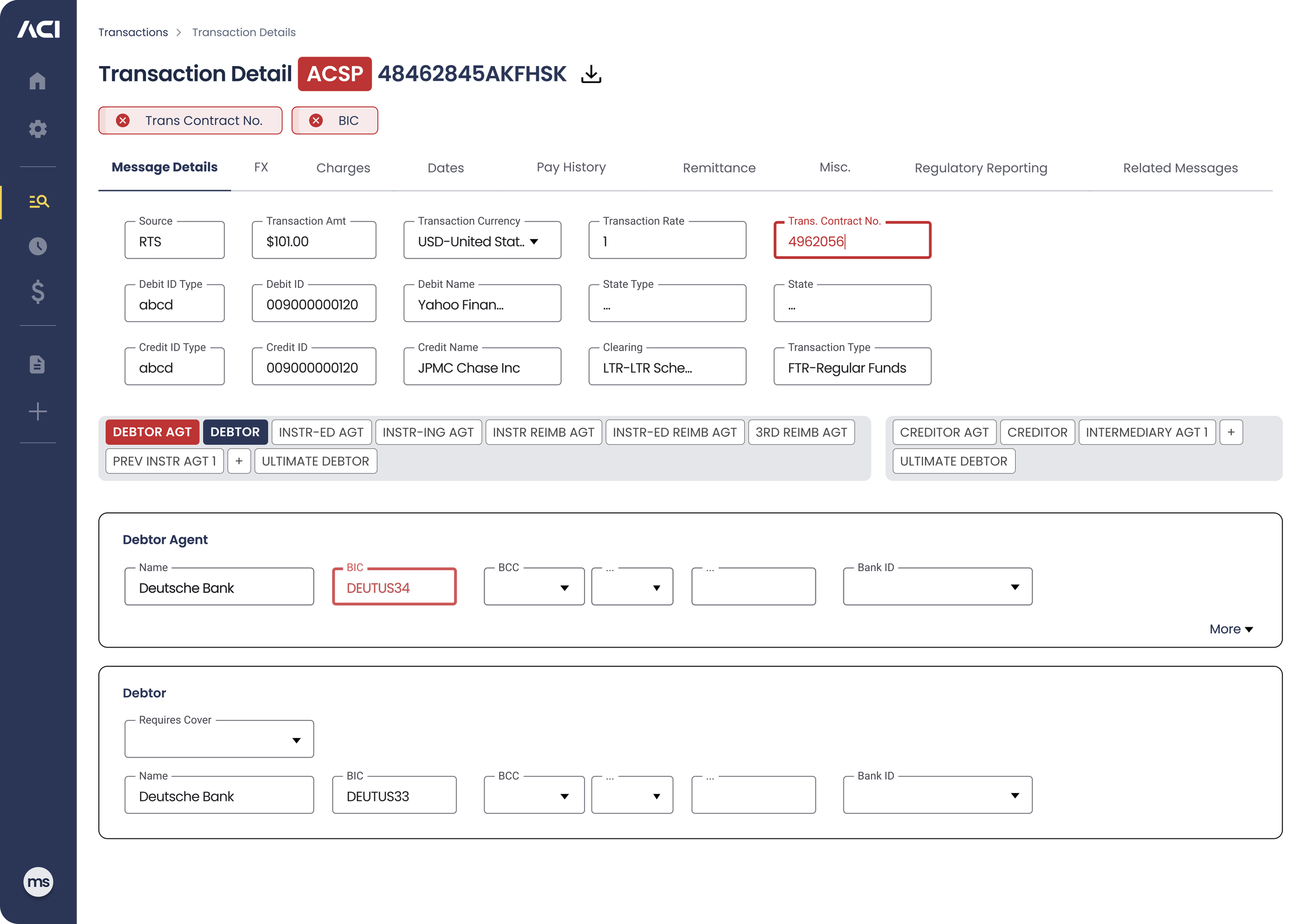
High Value Transaction Details
Problem: Legacy Software, UX Challenges, & Mindset Shifts
ACI Worldwide tasked me with ideating, envisioning, and redesigning their High-Value Payments applications. These applications, initially developed nearly 20 years ago, had become ingrained in the workflows of Customer Service Representatives (CSRs), Product Owners (POs), and stakeholders. Over the years, this legacy software not only facilitated high-value payments but also shaped how users handled transaction errors.
For CSRs, this was the only application they knew, making the transition to a modernized interface daunting. The lack of a design system compounded these challenges, particularly as we were building a “flagship” enterprise app suite. Establishing a design system became crucial to ensure consistency and scalability across the entire suite of new payment focused apps. However, one of the most significant hurdles was redesigning the heart of the system—the high-value transaction process itself.
Legacy…my starting point
Solution: User Customization & Relevant Data at the Forefront
To address the challenges of modernizing the HV Transactions page the solution centered around two key principles: user customization and placing relevant data at the forefront. Recognizing that CSRs had become accustomed to specific workflows over the years, we introduced adjustable form fields, allowing users to tailor how they absorbed data according to their preferences. By decluttering the interface and focusing on presenting the most pertinent data at each step of the transaction process, we improved both efficiency and user satisfaction. The design system ensured consistency across the application, while the flexibility of adjustable form fields helped ease the transition from the legacy system to a more modern, intuitive experience.
Removing Empty Data Fields
The legacy screenshot above shows 90 input fields…Holy Moly! And that’s all I could get on the screenshot, imagine scrolling forever to find relevant or populated data?
Blue Sections - On/Off States
The blue section on/off buttons highlight sections with populated relevant data upon loading. If a section contains no data, its corresponding on/off button is grayed out and the section is hidden from the page. Users can easily switch any of these inactive sections back on, and the corresponding section will render below, allowing them to add data to the transaction as needed. This approach reduced visual clutter, making it easier for users to navigate and interact with the transaction details.
User Defined Input / Data Field Custom Arrangement
In the creation of the new Google Material 3 based design system I opted to clean up the apps space by using side panel flyouts or drawers where ever I could. Part of those drawer icons were made for the user to arrange the input fields in the order that they liked to digest the transaction. Every User had a different absorption of the data the liked. So instead of us telling them how it should be, let the user decide. Depending on the
Transaction Errors: easier to navigate, update and fix
A User can now see quickly where the error is and start to identify what the need to do to fix it. Once errors are updated, the red status disappears at top of page, on the inputs and section buttons.
A Comprehensive Win: Streamlining UX for All Stakeholders
The redesigned high value transaction details screen was a success for both new and long-time users. By providing a cleaner, more intuitive interface and customizable data inputs, the solution met the needs of seasoned users while easing the learning curve for newer ones. Developers also benefited from the implementation of a scalable design system that streamlined future updates and ensured consistency. This approach not only improved user satisfaction but also enhanced workflow efficiency, reinforcing the value of modernizing all legacy applications.

